Intro
For quickly processing benchmark data, I wrote a rather complex bash script that allows querying data from a SQLite database to create gnuplot graphics (2D, 3D and histograms). In retrospect, this could probably better have become a Python program, but at that time, I was learning Bash and was experienced with SQL after several years of a student job programming Oracle.
[TOC]
Example
A quick example:
The benchmark was executed for a range of array sizes and a range of loading processes,
each for reading and writing.
It issued minimum, maximum and average values for array element access times.
It ran for a full weekend and created 6400 files.
A script processed the output files and created SQL insert statements,
that are directly piped to sqlite3 to create a database file (run time: approx. 1 minute).
Using sqlplot.sh, the session went approximately as follows:
$ sqlplot.sh data.db
Welcome to sqlplot 0.9 (14.6.2013)
Print help to get list of commands
sqlplot> desc data
CREATE TABLE data (
id INTEGER PRIMARY KEY,
load_method CHAR(2),
load_range INTEGER,
isol_method CHAR( 2),
isol_range INTEGER,
min NUMBER,
avg NUMBER,
max NUMBER);
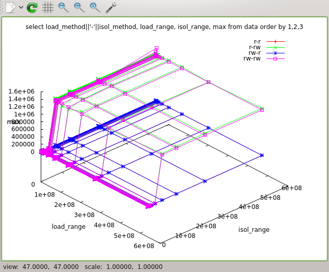
> select load_method||'-'||isol_method, load_range, isol_range, max from data order by 1,2,3
load_method||'-'||isol_method load_range isol_range max
----------------------------- ---------- ---------- ----------
r-r 1024 1024 220
r-r 1024 4096 200
r-r 1024 16384 200
r-r 1024 32768 220
r-r 1024 65536 176
r-r 1024 131072 200
r-r 1024 262144 268
r-r 1024 524288 180
r-r 1024 1048576 204
r-r 1024 2097152 288
...
rw-rw 536870912 536870912 1213684
> splot
The command splot creates a 3D plot.
It uses the three rightmost columns as x, y and z values.
Additional columns are used as keys for different data sets (here: 'r-r' etc.).
The resulting picture looked like this:
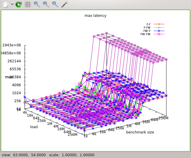
Some further tweaking gnuplot's settings:
> set logscale xyz 2
> set ticslevel 0
> set xlabel 'load'
> set ylabel 'benchmark size'
> set title 'max latency'
> log2tics x 1024 4 536870912
> log2tics y 1024 4 536870912
> splot
> splot max.svg
The last line stores a SVG image that can easily be converted to PDF, e.g. using Inkscape. (I favored SVG over PDF export, because when I wrote sqlplot, the SVG export of gnuplot was much nicer than its PDF generation capabilities.)
Documentation
The output of the help command:
help [xxx] - help [topic xxx]
exit       - quit program
desc       - list of tables or table description
select ... - SQL select statement
set ...    - set gnuplot options
unset ...  - remove gnuplot setting
show       - show current gnuplot settings
reset      - remove all gnuplot settings
plot       - xy plot of last query
hist       - histogram (bar plot) of last query
splot      - 3d plot of last query
load       - load *.sp script
Download
current version: sqlplot.sh